


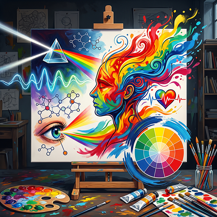
Science and Emotion on the Canvas: What Is Color, How Does It Govern Our Emotions, and What Is Color Theory?
In August 1888, Vincent van Gogh wrote to his brother Theo about a portrait he hoped to create. He wanted to paint "an artist friend who dreams great dreams, who works as the nightingale sings." Into the picture he wished to put his appreciation and his love for this friend. He would begin by painting him just as he was, with all the fidelity he could manage. To finish the painting he would become, in his own words, "an arbitrary colourist."
Behind the head, he planned, "instead of painting the dull wall of the mean room, I paint the infinite": a plain background in the richest, most intense blue he could prepare. The bright head set against that blue would produce, as he put it, a mysterious effect, "like a star in the deep azure." The portrait was painted at the beginning of September. The Belgian painter Eugène Boch sat for it as the model.
Van Gogh set out to express love through color. Science is still asking how color stirs emotion. In 2014, an article in the Annual Review of Psychology concluded that research in the field was still at an early stage. The journey that follows traces the path from the physics of light to the emotion of the viewer. It answers three questions: what color is, what color theory is, and how colors affect emotions. At its end stand the canvas and the portrait painting, the place where science and emotion meet.
What Is Color? What Newton Discovered in a Darkened Room
At the beginning of 1666, Isaac Newton darkened his room, cut a small hole in his window shutter, and set a triangular glass prism where the light came in. The prism bent the sunbeam onto the opposite wall. At first, he recalled, it was "a very pleasing divertisement" to watch the vivid, intense colors. Then came surprise: the colors spread into an oblong shape, although he had expected a round one.
He set out his conclusions in a letter sent in February 1672, to be presented to the Royal Society. "The most surprising, and wonderful composition," he wrote, "was that of Whiteness." No single kind of ray can produce it on its own: "'Tis ever compounded." Light, in his words, is "a confused aggregate of Rays indued with all sorts of Colors."
In his "Opticks," Newton stated the principle on which the answer to the question of what color is rests: "For the Rays to speak properly are not coloured. In them there is nothing else than a certain Power and Disposition to stir up a Sensation of this or that Colour." Color, then, does not reside in light itself. It is born in the one who looks.
Modern physics describes this in terms of wavelength. According to NASA, all electromagnetic radiation is light, yet human eyes perceive just a small slice of it, the part called visible light. The human eye typically detects wavelengths between 380 and 700 nanometers. Hence the short answer: color is the way the eye and the brain interpret the wavelengths of visible light.
From Eye to Brain: Why Not Everyone Sees the Same Color
NASA describes the cone-shaped cells of the eye as receivers tuned to this narrow band. The U.S. National Library of Medicine explains that the retina holds two kinds of light-sensing cells, rods and cones. Rods make vision possible in dim light. Cones make vision possible in bright light, and they are responsible for seeing color. There are three kinds of cones, and each responds most strongly to a particular wavelength. The retina and the brain bring together the signals from all three. This is how normal color vision arises.
Color vision is not identical in everyone. Among populations of Northern European descent, red-green color vision deficiency affects about one in twelve men and one in two hundred women. The U.S. National Eye Institute adds that "everyone sees color a little differently," even people who have no color vision deficiency.
The differences between people do not stop at the eye. In 2015, social media users were divided over a photograph of a dress. Some saw it as white and gold. Others saw it as blue and black. A study published that same year in Current Biology put the question to 1,401 respondents in a free-response survey. Most of them reported white and gold, or blue and black. Some said blue and brown. Examined on their own, the pixels of the photograph are brown and blue.
According to the researchers, the brain settles on one of three stable perceptions of the image. They hypothesize that the difference comes from differing assumptions about the light in the photograph. Those who assume the cool light of a blue sky see white and gold. Those who assume the warm light of an incandescent bulb see blue and black.
What Is Color Theory? From Newton's Circle to Goethe
Color theory is the field that sets out the relationships between one color and another: how colors mix, how they affect each other, and how they act on the person who looks at them. In "Opticks," Newton drew a circle and divided its circumference into seven parts, in proportion to the seven musical tones. Each part stood for a color: red, orange, yellow, green, blue, indigo, and violet. The circumference as a whole stood for the full sequence of colors, from one end of the band cast by the prism to the other.
According to Tate, complementary colors in color theory face each other on models such as the color wheel. They are pairs that contrast with each other more strongly than with any other color. Set next to each other, each one makes its partner look brighter. On a wheel whose primary colors are red, yellow, and blue, green faces red, orange faces blue, and violet faces yellow.
In 1810, Johann Wolfgang von Goethe published a book whose title is, quite literally, color theory: "Farbenlehre," which its English translator rendered as "Theory of Colours." In it, Goethe explained the colors of the spectrum by principles that departed from Newton's accepted theory. His opposition to Newton's doctrine was fierce.
In the sixth part of the book, Goethe turned from light to the mind. The effects of color, he wrote, are "at all times decided and significant," and they are "immediately associated with the emotions of the mind." To yellow in its highest purity he attributed "a serene, gay, softly exciting character." In blue he saw "a kind of contradiction between excitement and repose." As he put it, "we love to contemplate blue, not because it advances to us, but because it draws us after it."
An English translation by Charles Lock Eastlake appeared in London in 1840. Three years later, Joseph Mallord William Turner exhibited a painting titled "Light and Colour (Goethe's Theory)".
From Theory to Canvas: Color as a Language of Emotion
According to Tate, it was after scientific color theory took shape in the nineteenth century that artists grew especially conscious of what complementary colors signify. Tate credits the Impressionists as the first to observe that shadows are not neutral. The color of a shadow complements the color of the light that casts it: yellow sunlight casts a violet shadow.
James McNeill Whistler gave the portrait of his mother, painted in 1871, a name made of colors: "Arrangement in Grey and Black No. 1." That portrait is discussed in the article on portrait painting of a woman.
Van Gogh wrote about color in a different vein. In the same August 1888 letter, he explained: "instead of trying to render exactly what I have before my eyes, I use colour more arbitrarily in order to express myself forcefully." His way of working, he wrote there, had been "fertilized more by the ideas of Delacroix" than by those of the Impressionists. According to the notes in the edition of his letters, Van Gogh had Gauguin in mind when he planned the portrait of the "artist friend."
In the portrait he eventually painted, now in the Musée d'Orsay, Boch's head stands out, in Van Gogh's words, "against a starry sky of deep ultramarine." Boch wears a short yellow jacket. Van Gogh called the painting "The Poet." It is known to have hung for a while in his bedroom at the Yellow House: it can be seen in the first version of the painting "The Bedroom."
At the beginning of September 1888, Van Gogh told Theo what he wanted color to do: "To express the love of two lovers through a marriage of two complementary colours, their mixture and their contrasts, the mysterious vibrations of adjacent tones. To express the thought of a forehead through the radiance of a light tone on a dark background. To express hope through some star." He added: "That's certainly not trompe-l'oeil realism, but isn't it something that really exists?" Van Gogh's self-portraits are the subject of the article Van Gogh, a stormy portrait painter.
In the paintings of Pablo Picasso's "Blue Period," from 1901 to 1904, the artist "restricted himself to a cold, monochromatic blue palette" and to "emotional, psychological themes of human misery and alienation." That is how the Art Institute of Chicago describes the paintings of the period. One of them, "The Old Guitarist," is in the museum's collection.
In the autumn of 1905, most likely, Henri Matisse painted his wife, Amélie. The summer before, in the fishing village of Collioure, he and André Derain had carried out ever-wilder experiments, "intended to release colour from its descriptive function, allowing it to act as a force in its own right." In the portrait built on those experiments, "Portrait of Madame Matisse. The Green Line", the sense of spatial depth is kept to a minimum. Light and shadow, which would have given the image depth, are rendered instead as flat areas of color. A "stripe of provocative green" runs down her worried face and splits it into two halves of different colors.
SMK in Copenhagen, where the painting is held, counts it among Matisse's best-known works and regards it as a masterpiece of twentieth-century portraiture. The museum asks: "Did Madame Matisse really look like that? With a green line crossing her face?" Its answer: "Yes and no!" That same year, the critic Louis Vauxcelles saw the work of Matisse and Derain at the Salon d'Automne in Paris. It was he who coined the name les fauves, "the wild beasts." According to Tate, the paintings they showed were made in "bold, non-naturalistic colours (often applied directly from the tube)."
Wassily Kandinsky expressed the idea through a musical image. In his book "Concerning the Spiritual in Art" he wrote: "Colour is the keyboard, the eyes are the hammers, the soul is the piano with many strings. The artist is the hand which plays, touching one key or another, to cause vibrations in the soul."
How Do Colors Affect Emotions? What the Research Says
A study published in 2020 in the journal Psychological Science opens with three English idioms: to "see red," to "feel blue," and to "turn green with envy." Then the researchers ask: "Are such color-emotion associations fundamental to our shared cognitive architecture, or are they cultural creations learned through our languages and traditions?"
To find out, they examined the emotional associations of colors among 4,598 participants from thirty nations, speakers of twenty-two native languages. The participants linked twenty emotion concepts to twelve color terms. The study found universal links between color and emotion, with an average similarity coefficient of 0.88. Alongside them, local differences emerged. Nationality predicted the associations beyond the universal pattern. The resemblance was stronger between nations close to one another in language or geography.
Another line of research seeks to explain why people prefer some colors over others. In 2010, Stephen Palmer and Karen Schloss of the University of California, Berkeley, introduced the "ecological valence theory". According to the theory, color preferences grow out of the average emotional response to objects linked with each color. People are drawn to colors tied to things they like, such as the blue shades of clear skies and clean water. They turn away from colors tied to things they dislike, such as the brown shades of feces and rotten food. The empirical test the two carried out gave the theory strong support.
Language, too, affects how colors are told apart. Unlike English, Russian requires speakers to distinguish light blue, "goluboy," from dark blue, "siniy." In a study published in 2007, Russian speakers told two shades of blue apart more quickly when the shades fell on opposite sides of that boundary than when both belonged to the same category. English speakers tested with the same stimuli showed no such advantage.
In 2005, Hill and Barton reported in the journal Nature that "across a range of sports," wearing red "is consistently associated with a higher probability of winning." The hypothesis that red heightens heterosexual attraction in romantic settings was tested in 2018 in a meta-analysis. For men rating women, the analysis found a small effect. For women rating men, it found a very small one. The authors added that the size of the effect may have shrunk over the years.
What can be concluded from all this? In an article published in 2014 in the Annual Review of Psychology, Elliot and Maier reviewed the research in the field. They concluded that "color can carry important meaning and can have an important impact on people's affect, cognition, and behavior." At the same time, according to the article, the literature on color psychology is still at an early stage. A great deal of work remains before firm theoretical claims, or advice on practical use, can be justified. In 2015, Elliot returned to the point and recommended patience and prudence.
The answer to how color "governs" human emotions is therefore more complex than the title suggests. Color does not flip a switch in the mind. It works through meanings and associations. Some of them are universal, as the researchers put it. Others are shaped by language, surroundings, and context. These are precisely the layers in which the painter works.
Color in a Custom Portrait Painting
Anyone who commissions a custom portrait painting can bring these considerations to the canvas. The portrait paintings of You Are Art are the work of Hee-Lee Soffer, whose master's degree is in art history. An oil on canvas portrait is built up in layers of paint, with oil thinned to varying degrees, to achieve a realistic look. Its colorful, spectacular appearance endures for many years. A watercolor portrait is painted in water-based colors at varying degrees of transparency. Its look is sensitive and romantic. In pencil, ink, or charcoal drawings, the materials themselves lend a beloved face depth and emotional quality. A digital portrait is created entirely by hand, with digital brushes and a graphic drawing board. It allows for endless shades.
A specific background can be requested for the portrait, like the blue that Van Gogh placed behind Boch's head. A painting can also be commissioned in colors chosen to suit the room where it will hang. The relationship between a portrait painting and the home is explored in an article about portrait painting in interior design. What sets the three drawing materials apart is explained in the article on the difference between pencil, charcoal, and ink. Anyone torn between techniques or shades can consult the painter before deciding.
Frequently Asked Questions About Color, Emotion, and Color Theory
What is color? Color is the sensation that the eye and the brain create from visible light. The human eye typically detects wavelengths between 380 and 700 nanometers. In his "Opticks," Newton already wrote that the rays themselves are not colored. They carry only a power and a tendency to arouse the sensation of a color.
What is color theory? It is the field that sets out the relationships between colors: how they mix, how they affect one another, and how they act on the viewer. Newton arranged the colors of the prism on a circle. In 1810, Goethe published a book titled "Farbenlehre," or "Theory of Colours," and devoted an entire part of it to the effect of color on emotion.
What are complementary colors? They are pairs of colors that face each other on the color wheel. On a wheel whose primary colors are red, yellow, and blue, green faces red, orange faces blue, and violet faces yellow. According to Tate, when the two are set next to each other, each one makes its partner look brighter.
Do colors affect emotions? Yes, but according to academic articles from 2014 and 2015, research in the field is still at an early stage. A study in thirty nations found universal links between colors and emotions, which also vary with language and geography. Those articles call for caution before practical conclusions are drawn.
What color is calming? The studies presented here do not point to one calming color. Goethe wrote that the eye and the mind come to rest on green. For that reason, he said, green is the color most often chosen for rooms that are lived in day after day. This is Goethe's view and not a research finding. The articles that reviewed research on color psychology called for caution about claims of this kind.
The Color in the Portrait
Van Gogh wanted to put his love into the portrait of a friend. To do so, he chose the richest, most intense blue he could prepare. Matisse crossed his wife's face with a green stripe. Research explains part of the way such choices reach the viewer. The rest it examines with caution.
Color theory gives the painter a grammar: contrasts, complements, and shades. The content comes from the face on the canvas and the love behind it. In the portrait paintings gallery, oil, watercolor, drawing, and digital portraits can be seen on real faces.
Commission a portrait painting that speaks the language of color